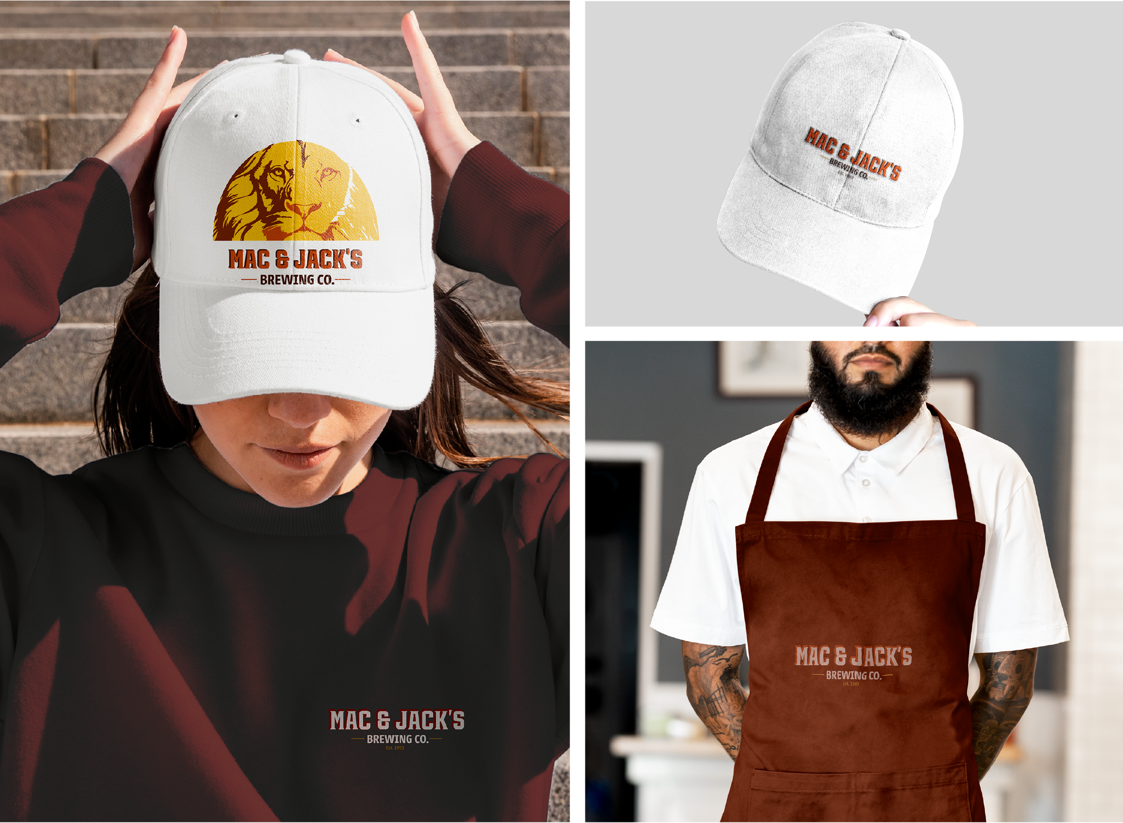
Mac & Jack’s Rebrand
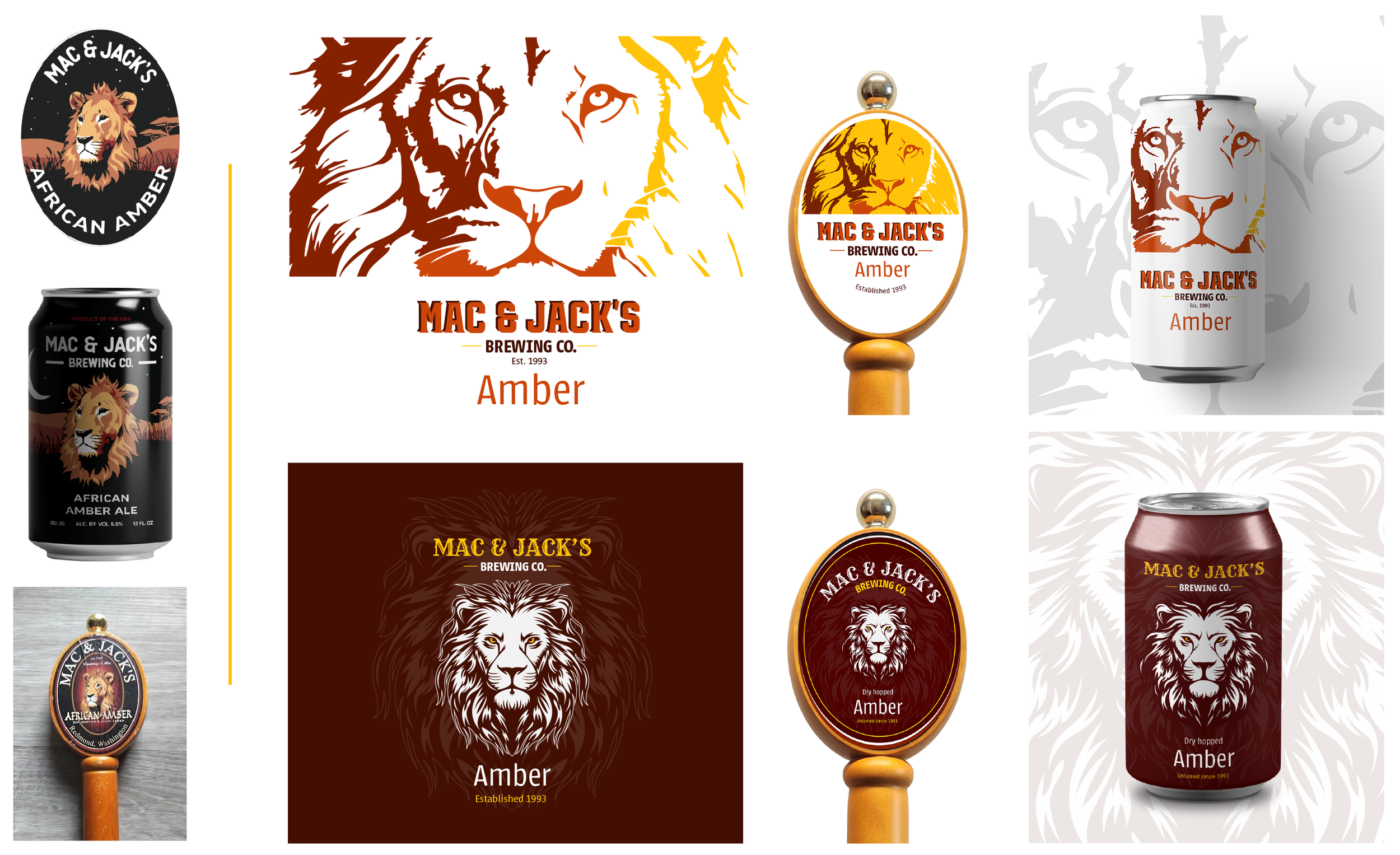
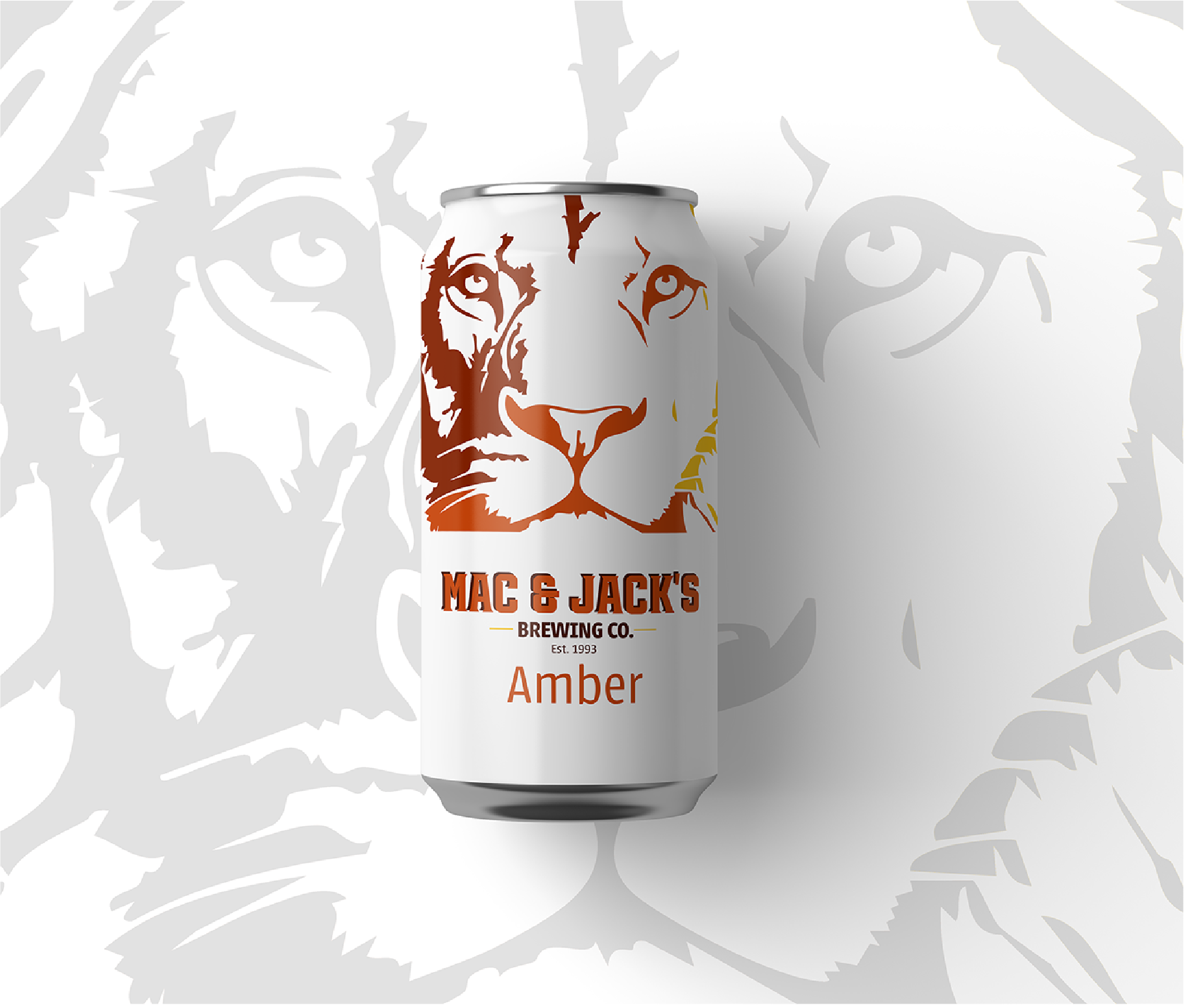
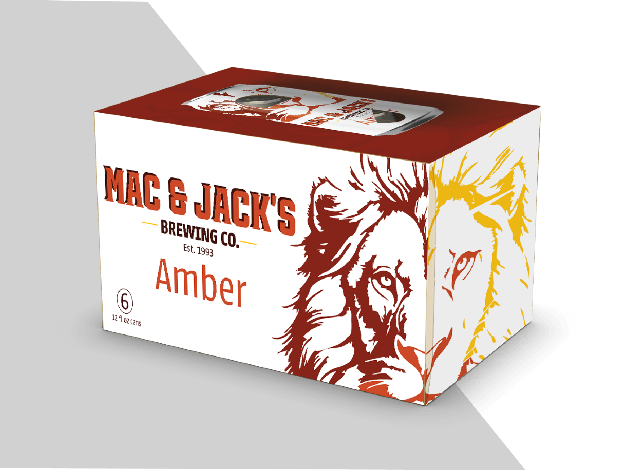
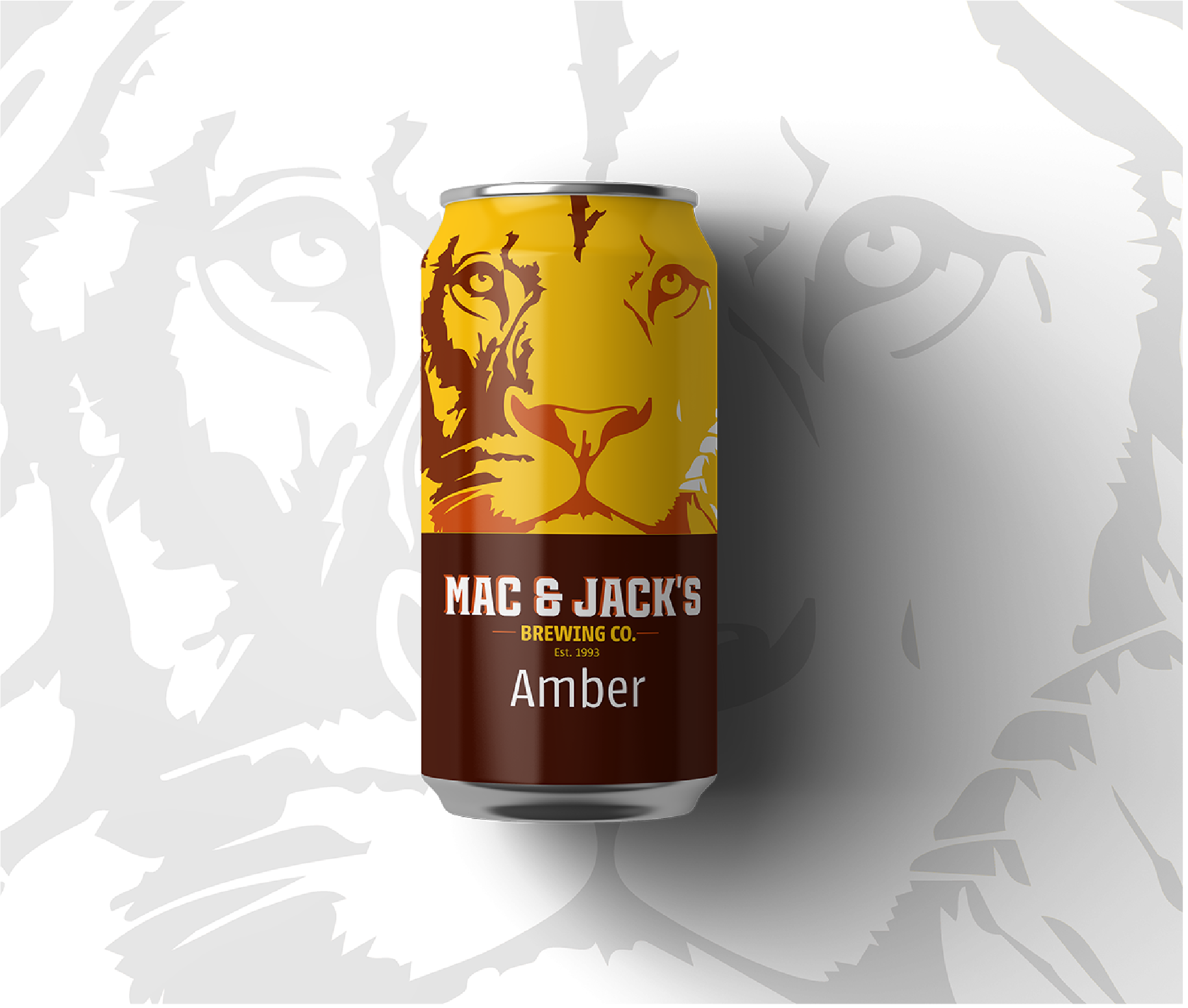
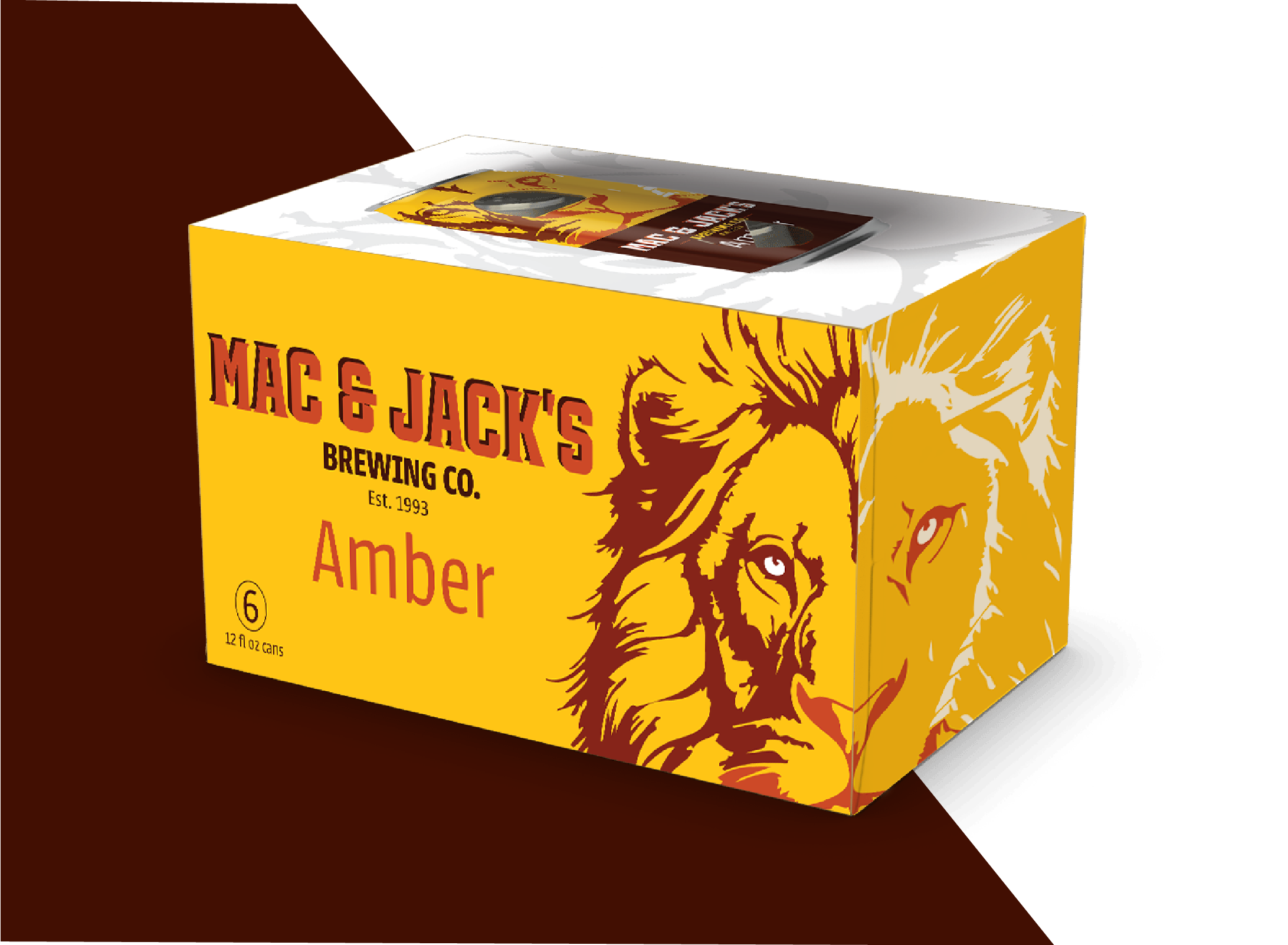
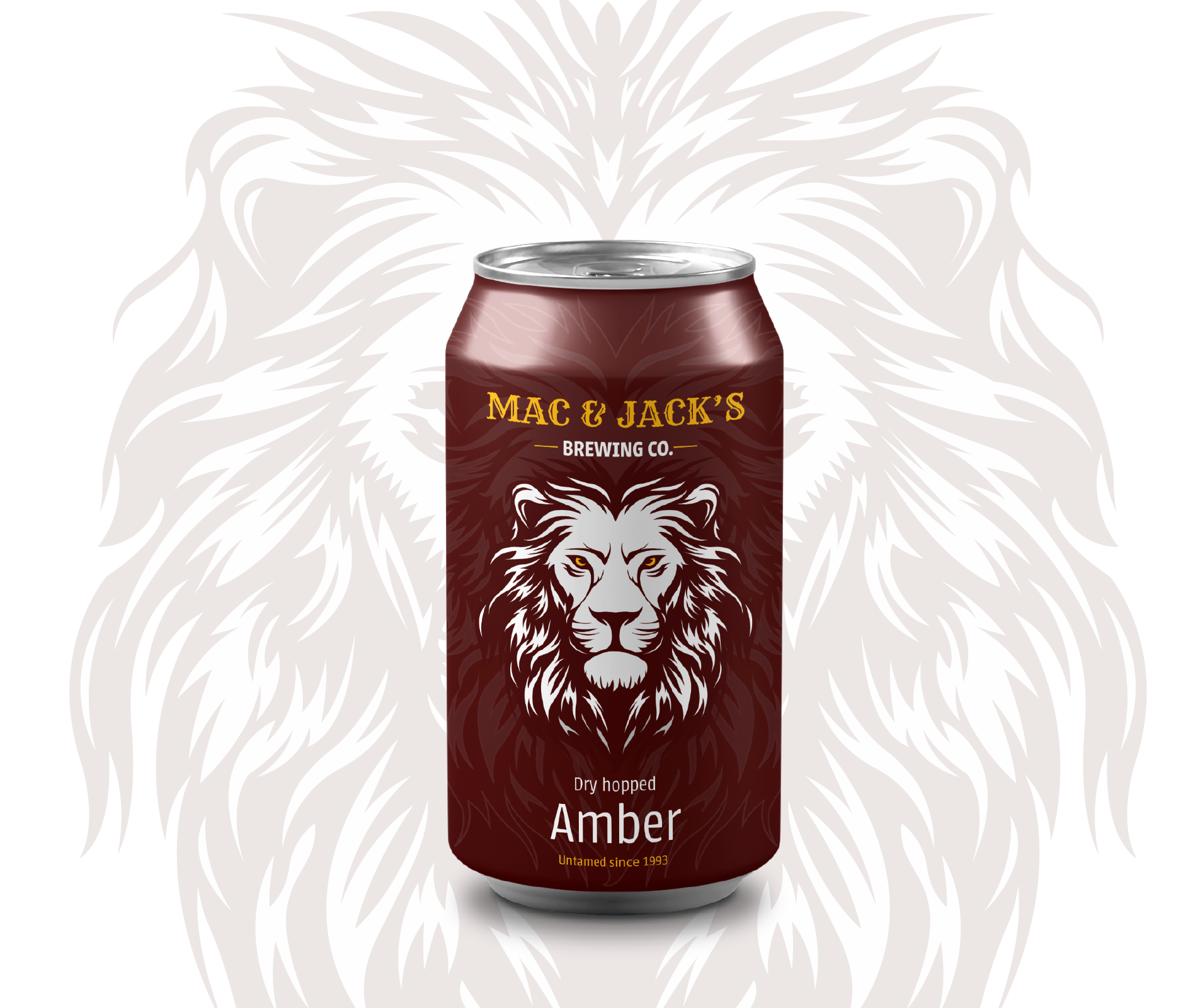
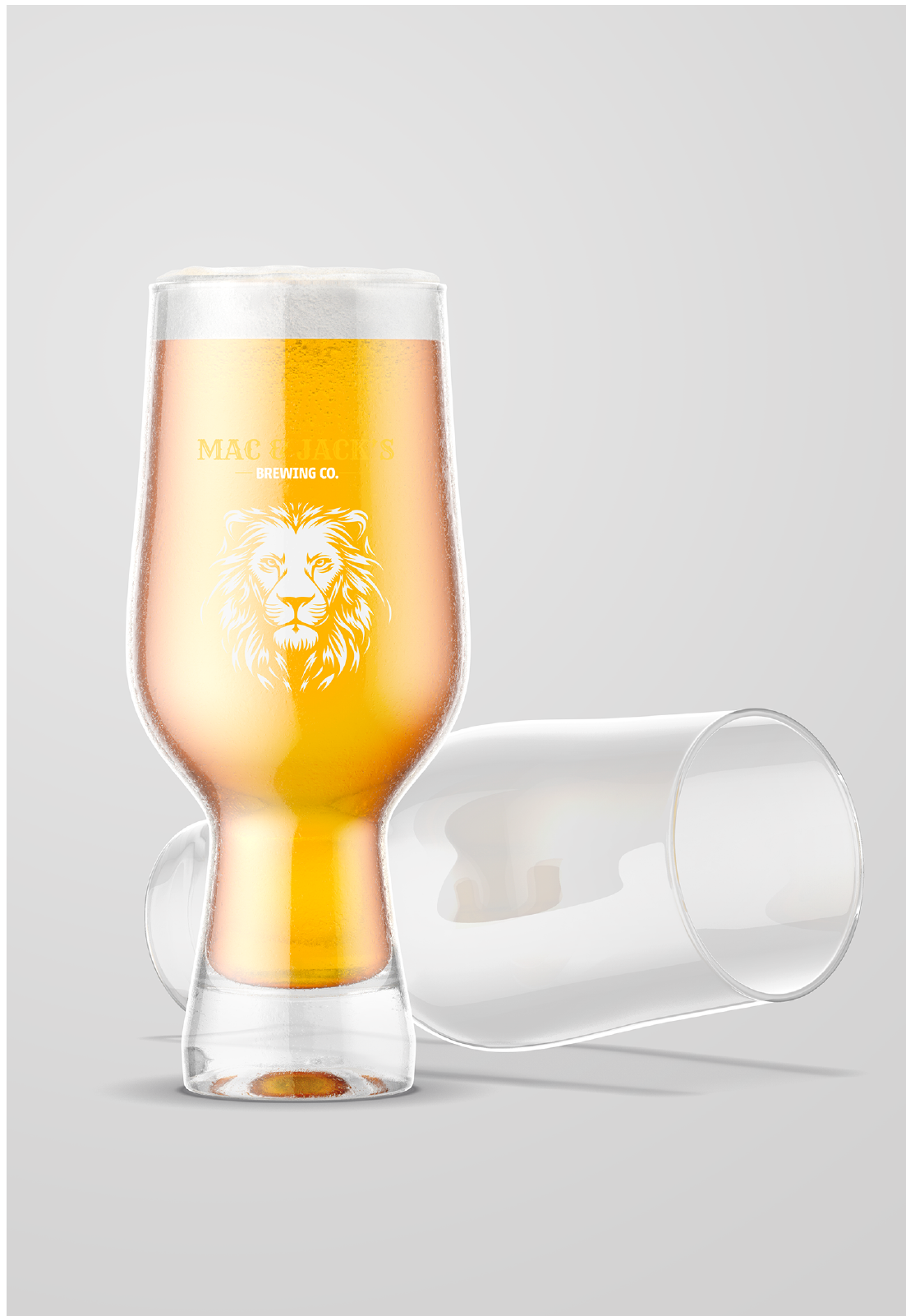
Mac & Jack’s Amber rebrand and consequent other variety of beers were triggered by an outdated story and art style. The client needed the branding to remain somewhat recognizable per the equity in the brand as well as revitalize the image, with fresh schemes and familiar themes to capture the attention of the consumer in a retail location and pub setting. In keeping the lion, we have respected the equity of the brand, but eliminated the “African” from African Amber, which felt outdated. The tap handle creative was kept in an oval circle for recognizability in a pub while also being utilitarian so that existing prepurchased handles can be reused with fresh labels.

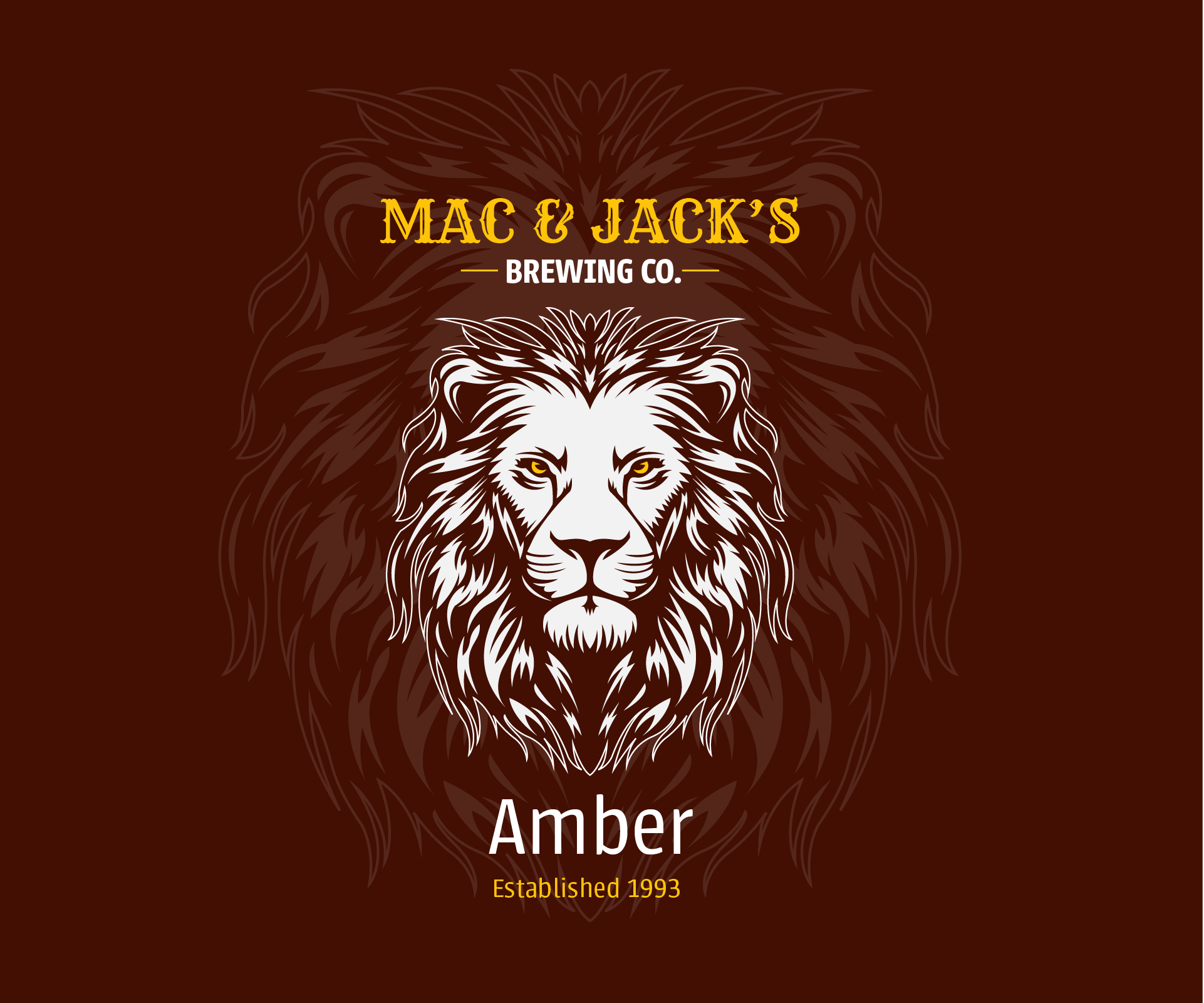


Evolution of a brand
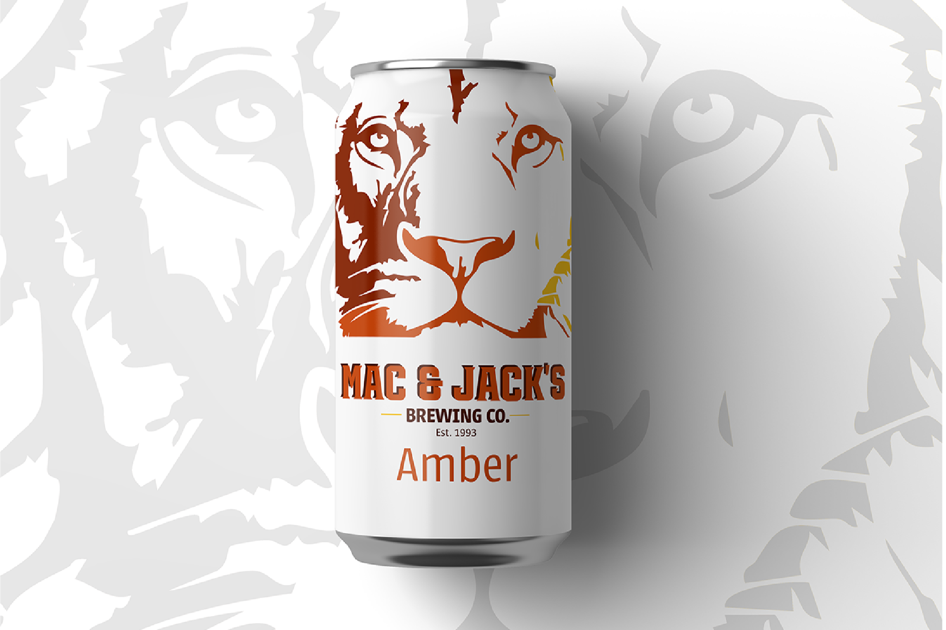
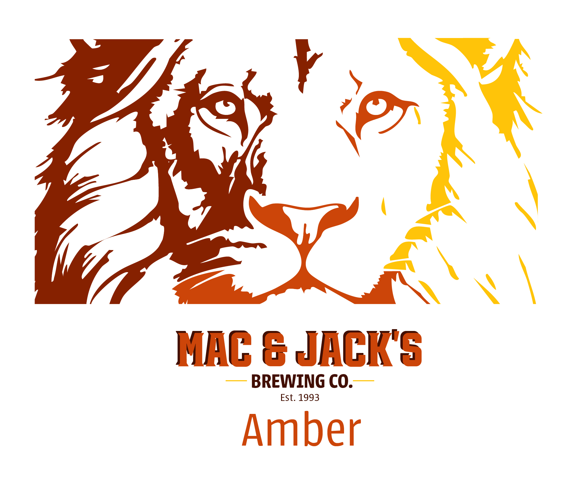
When comparing the existing creative to the updated concepts, we can see how the equity of the brand is respected while other aspects are changed. The African Amber, the flagship brew from Mac & Jack’s has utilized a lion as its primary identifier since its creation. To respect the equity it brings to the brand, we continued our approach to the redesign by recreating the lion, however making it more bold. There is a dark and light option, bringing in vibrancy to the design in place of muted earth tones. Combined with brighter colors, the expression on our lion is affirming over apathetic. Its commanding presence would allow it to stand out on retail shelves, refrigerators, as well as tap walls.